 Umbracolombia
Part I — Umbraco 11 to 18, with the whole site hand-written inside the master
There is a version of this work that sounds good in a proposal: "we migrated from Umbraco 11 to 18 and modeled the content as reusable components." It is true and it is useless, because it hides the order. And the order is nearly all that matters, because each step could only be taken once the previous one was done.
The two sites were an ordinary case. A CMS installed years ago that in practice administered nothing: it held the SEO fields and that was that. Everything else — the headlines, the paragraphs, the cards, the services — was hand-written inside the Razor views. Changing a single word took a developer, a pull request and a deploy.
And the deploy had been broken since 2023. That is why the footer had spent two years saying "© 2024": not because nobody cared, but because nobody could fix it.
First: the repository was lying
The first thing was not touching Umbraco. It was finding out that we could not.
The last commit on main was from April 2023. The application on Azure, meanwhile, had gone on being edited directly the whole time: the views in September 2023, the uSync files in June, the models regenerated in September 2024. Three years of work that existed only on the server.
The serious part was not the mess. It was this: if we deployed main as it stood, the site would lose its styles. The CSS and JavaScript that serve the live site had never been in the repository. A "normal" deploy — the one anybody would have run on day one — would have left both sites as plain text.
So step zero was to pull reality down. We copied the views, the uSync files and the whole of wwwroot from the Azure application — read-only — and put them in a commit that says what it is: a photograph of what exists, not an approval of what exists. From there we had an honest starting point that could be compared against.
If you take one thing from this article, take this one: before migrating anything, check that you can reproduce what is already live. On a project that has gone years without a deploy, that check fails more often than you would expect.
Then: up one version at a time
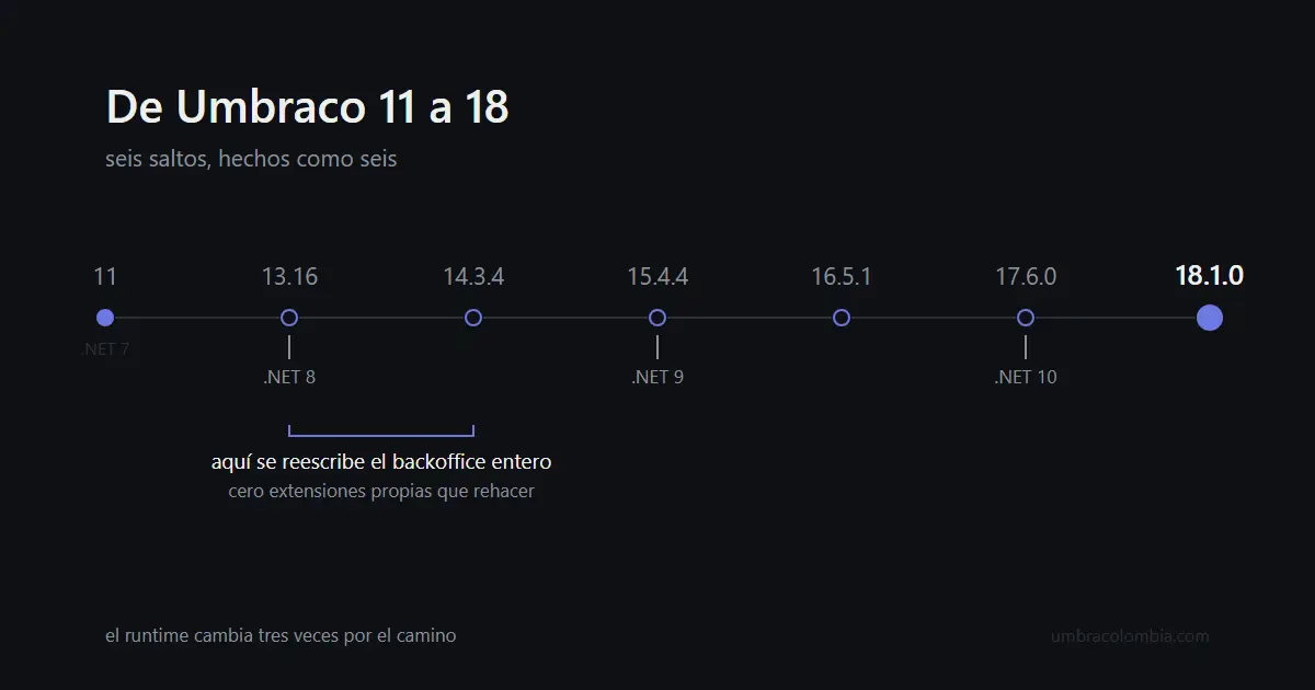
From 11 to 18 there are six hops. We took them as six, not as one: 13.16 on .NET 8, 14.3.4, 15.4.4 on .NET 9, 16.5.1, 17.6.0 on .NET 10, and 18.1.0. Each one building and starting before the next one began.
It sounds tedious and it was the cheap part of the project, for a reason worth saying out loud: the cost of this migration does not depend on how many versions you cross, it depends on how much backoffice you have written. The 13-to-14 hop is the complete rewrite of the backoffice — from AngularJS to web components — and there is no compatibility layer: every custom property editor, dashboard and content app is rebuilt from scratch. These two sites had none. That is why they walked straight past the wall that makes this migration expensive for almost everybody.
If your site does have a custom backoffice, that is the budget conversation. Not the six hops: count your property editors.
The second thing that genuinely changes sits deeper. Since version 15, walking the content tree is not done the same way: Children() and its relatives now need navigation services and, above all, they need you to tell them which language you are asking about. The old code still compiles. It just answers something else.
With the version up, we fixed the deploy. It was broken because the GitHub actions it used had been retired, and until it worked again everything else was theoretical: a CMS you cannot deploy is not a CMS, it is a backup.
Before touching the content: a photograph
This is where the project gets interesting, because taking the HTML out of the views and putting it into the CMS changes the shape of the markup. The easy check — "the HTML is identical" — stops being available, and has to be replaced with something else.
What we did was photograph both sites, on desktop and on mobile, before moving a single line. The idea is obvious. What is not obvious is that the first photograph came out wrong twice, and both times it would have lied in our favor.
The first: the pages load a couple of third-party scripts that never finished responding here, so the browser never considered the page loaded and three of eight captures timed out. We blocked them. Beyond fixing the capture, it is the right thing for another reason: a third party's script should not be able to change what a comparison sees.
The second is the frightening one. The theme starts its elements invisible and reveals them on scroll. A full-page capture does not scroll. The result: the first baseline captured the hero without a single word on it — and it would have captured the "after" exactly the same way. The two photographs would have matched perfectly, and they would have matched in not showing the content the script existed to watch.
A comparison that passes because both sides are equally empty is worse than having no comparison, because it also puts you at ease.
The big step: getting the HTML out of the master
Only then did we move the content.
The first instinct is to look for the template the two sites have in common and extract it. There is none: the two sites do not merely look different, they are built differently. Of eight sections, exactly one appears on both, and even then one runs to 134 lines and the other to 55. There was no page to extract; there were pieces that recurred in a different shape.
So the unit was not the page but the block. Eight types came out — the hero, the card, the card grid, the contact form, the rich text, the service, the service list, the logo wall — and each one holds what the business wants to say, never how it looks. How it looks lives in one file per theme, and the theme is chosen by reading a property at the site root.
The border between those two things is easiest to see in a small example. The editor picks that a service is of type settings; the theme translates that into whichever icon class it has:
["settings"] = "sl-config",
["quality"]  = "sl-diamond",
["training"] = "sl-globe",
["support"]  = "sl-config",   // ran out of icons and reused the first one
That map is ugly and we left it that way deliberately, because it is the proof: the theme came up short and the content did not care. If a theme with SVG icons arrives tomorrow, this table changes and not one content field does.
And a warning for anyone about to do the same: today, if the editor needs a fifth type of service, they need a developer again. The border is in a sensible place, but it is where the project needed it, not where it would be perfect.
What got lost along the way
With both sites running on blocks, we compared against production. Production served 22 images; our version, 17.
Most of the gap had an explanation: seven client logos had changed folder on their way into the media library, and two badges we had removed on purpose. Three were real losses.
The Colombian site's four-card grid alternated text, image, image, text. Moving it to blocks, we took the two text cards and left the two image ones behind, because the model we had designed had a field for text and none for that. And an image that stood alone after the logo carousel had nowhere to go, so the logo wall block had to gain a new field.
None of the three threw an error. The pages loaded with a 200 and looked reasonable. They were found by counting images against the live site.
And in cleaning up, five theme sections turned up that nobody used any more. One of them painted sixteen client logos that came from the purchased template: fake logos presented as clients. It was linked from nowhere, so it never actually appeared. It was one distracted include away from appearing.
What we took away
Three things, and none of them is about Umbraco.
The first: the step that looks administrative — checking that the repository reproduces what is live — was the only one that, if skipped, erased three years of somebody else's work.
The second: every automated check has to be tested against a known failure. Our visual baseline passed with both sides empty. If we had not gone over it by eye, the project would have had a safety net that only knew how to say yes.
The third: nobody noticed that the two sites shared no composition until somebody sat down and counted how many sections actually matched. The architectural decision did not come from experience or from taste. It came from a subtraction.
And the footer cannot stay at 2024 any more, because the template calculates the year and an editor changes the text without having to ask anybody for anything.